Saturday, April 28, 2012

76. Before and After Color Analysis Photos

There is a pervasive trend in seasonal color analysis websites and books to  stage "before" and "after" photos.  The "before" pictures appear in a disparaging light, and the "after" pictures are enhanced.  Take a close look.  It's actually effective, though deceiving, advertising. 

You might see the following staging effects, among others. All strive to present the "after" model who's wearing a color from the "correct" palette in a favorable light.

In "before" photos
  • Hard, bright lighting that leaves the subject looking "washed out."
  • An unflattering facial expression, such as an unnecessarily wrinkled forehead.
  • An unflattering pose.
  • Unflattering clothing, accessory, and/or hair style.
In "after" photos
  • Soft lighting with proper exposure.
  • A relaxed, pleasant facial expression.
  • Small, but significant, improvement in pose.
  • More becoming clothing, accessories, and/or hair style.
Notice that the photographer's tricks, above, disallow an objective judgement of the better color choice.


Friday, April 20, 2012

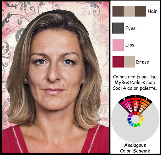
75. Analagous Color Scheme, Neutral 5 Color Palette


Brilliant new color analysis technology, used by MyBestColors.com, creates Smart Palettes so that your best color choices can readily be applied.


Sunday, April 15, 2012

74. Something Special


Here's a playful video by MyBestColors.com for all color analysis lovers who want to discover what colors to wear for their skin tone.

Thursday, April 12, 2012

73. Analagous Color Scheme, Cool 2 Color Palette


This NEW color analysis method finds your set of 380 best colors to wear through
color quantification computer technology. We search millions of colors, and precisely select a harmonically cohesive palette of 380 best colors for your skin tone. All of them will mix-and-match with stunning success, and any two or more will harmonize perfectly
with your complexion.


Saturday, March 31, 2012

Sunday, March 25, 2012

71. How to Print Your Personal Color Palettes

Once purchased, your requested personal color palette will be emailed to you within 24 hours. To print colors that accurately match your color analysis palette do one of the following:  use a personal photo printer at home (Kodak and Hp are very good at producing accurate color), or go to a self-serve photo printing kiosk.  Places like Walgreens, Walmart and Kinko's have these.  The print color is almost always very, very good.  It's quick, too.  And the price is right.  While you're at one of those stores you can also purchase a simple hardcover $2.00 photo album that will do a good job of holding up to a lot of use.

Please be aware that you must not have your palette printed on one of the large $10,000 commercial printers.  They use a process that will render colors much too dark.  Even the Kodak printing by mail system uses this inaccurate system.  Again, use a self-serve photo kiosk.  Proceed cautiously.  It would be a good idea to print only 1 page initially to check the color quality. If that particular kiosk is not up to par, then select another one.

This process will assure that you have an accurate resource for the best colors to wear for your skin tone.


Monday, September 12, 2011

67. Pantone Fashion Color Report Fall 2011

Wear your own "best for you" versions of the Pantone Fall 2011 fashion colors (shown below) from your own MyBestColors.com color palette.                                           
                                                                                                 

Sunday, September 4, 2011

65. Henri Matisse Art--Warm 5 Palette Colors, Triad Color Scheme [First Edition]

Henri Matisse designed this lovely piece, however these particular colors are not his choices.  Instead, they're from the Warm 5 MyBestColors.com color palette using a Triad color scheme. I want you to realize that skin tone is not magical or imbued with uniqueness such that it need require one to wonder and speculate over to an unusual degree.  Many people question for years, "Am I a warm, neutral or cool skin tone?  How can I be sure?  What colors go with my skin tone? Am I an absolute color category, or a mixed category?  Who is smart enough, talented enough, trained enough to determine my correct color palette?"  Skin tone is a color like other colors, and can be worked with as such.  MyBestColors.com uses new computer quantification technology to simply coordinate a palette of 620 harmonizing colors to your skin tone, which is identified by matching a common brand of makeup to your skin.  Please go to www.MyBestColors.com for more information. 

Wednesday, August 31, 2011

64. Rainbow Colors--Comparison Between Two Palettes [First Edition]

Here, we have an interesting comparison between a sampling of Cool 1, and Warm 8 palette colors.  Both sets contain representative colors from every hue ("color") of the rainbow.  They differ, primarily, in the amount of contrast available within the palettes.  There is more contrast (difference) between the colors in the Warm 8 palette than there is within the Cool 1 palette.  By contrast, I mean there's a greater range available between the lightness and darkness of colors (value), and the intensity and dullness of colors (chroma). Darker skinned people can wear much more contrast than can fair skinned people.

 However, if a fair-skinned person has very dark hair, eyes or eyebrows, then their natural coloring allows for additional contrast.  To provide for this, the lightest palettes include some strong colors that are marked with an asterisk. These are to be added into the palettes when more contrast is allowed and desired.


63. Rainbow Colors--W7 Palette Colors [First Edition}

Look at this gorgeous array of color!  All colors are from the MyBestColors.com Warm 7 color palette.  And all are perfectly (mathematically) harmonious.


Sunday, August 21, 2011

60. Example of a Square Color Scheme [First Edition]

Not only is this lovely model wearing her correct colors, but she is also wearing her correct contrast range.  Her very dark hair, eyes and eyebrows require her to wear at least a dab of her lightest and darkest colors (along with whatever other correct colors she wishes) in order to make her appear "focused."                  

59. Example of a Split-Complementary Color Scheme [First Edition]


The three color swatch pages (above) come from this model's correct color palette. Colors found in the image, either on the model or in the frame, have a black frame around them.  Notice the two darkest color swatches that have a white asterick.  Had they been used on the model, they would have commanded too much attention.  They would have overpowered her image.  The asterick-marked color swatches should only be used if the person has eye, eyebrow or hair color that is at least that dark.  In such a case, at least a touch of one of the darkest colors would be needed to balance her contrast level, and make her appear "in focus." 


    People with very dark skin and hair should wear contrast colors that span from one of the lightest to one of the darkest colors in their palette, even if  just a touch of color.  It will balance their overall appearance. 

Saturday, August 20, 2011

58. Example of a Triad Color Scheme [First Edition]

The three color swatch pages come from this model's correct color palette.  Colors found in the image, either  on the model or in the frame, have a black frame around them.