

Tuesday, September 27, 2011
Wednesday, September 21, 2011

Monday, September 12, 2011
67. Pantone Fashion Color Report Fall 2011
Wear your own "best for you" versions of the Pantone Fall 2011 fashion colors (shown below) from your own MyBestColors.com color palette.

Thursday, September 8, 2011

Sunday, September 4, 2011
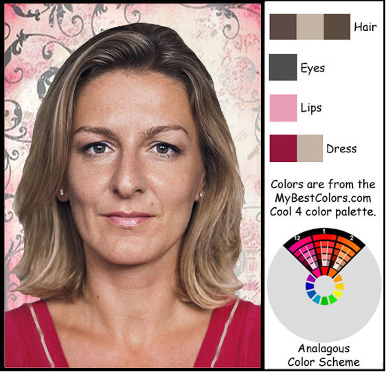
65. Henri Matisse Art--Warm 5 Palette Colors, Triad Color Scheme [First Edition]

Wednesday, August 31, 2011
64. Rainbow Colors--Comparison Between Two Palettes [First Edition]

However, if a fair-skinned person has very dark hair, eyes or eyebrows, then their natural coloring allows for additional contrast. To provide for this, the lightest palettes include some strong colors that are marked with an asterisk. These are to be added into the palettes when more contrast is allowed and desired.
63. Rainbow Colors--W7 Palette Colors [First Edition}
Look at this gorgeous array of color! All colors are from the MyBestColors.com Warm 7 color palette. And all are perfectly (mathematically) harmonious.

Tuesday, August 30, 2011

Thursday, August 25, 2011

Sunday, August 21, 2011
60. Example of a Square Color Scheme [First Edition]
Not only is this lovely model wearing her correct colors, but she is also wearing her correct contrast range. Her very dark hair, eyes and eyebrows require her to wear at least a dab of her lightest and darkest colors (along with whatever other correct colors she wishes) in order to make her appear "focused."

59. Example of a Split-Complementary Color Scheme [First Edition]

People with very dark skin and hair should wear contrast colors that span from one of the lightest to one of the darkest colors in their palette, even if just a touch of color. It will balance their overall appearance.
Saturday, August 20, 2011
58. Example of a Triad Color Scheme [First Edition]
The three color swatch pages come from this model's correct color palette. Colors found in the image, either on the model or in the frame, have a black frame around them.

Thursday, August 18, 2011


Monday, August 15, 2011
55. Square Color Scheme, N1 Palette Colors [First Edition]
With MyBestColors.com color palettes, combined with the use of suggested color schemes, you will find beautiful and perfectly harmonious color combinations that you could never have found using any other system.

Friday, August 12, 2011
54. Notes on the MyBestColors.com System
[The following pertains to the First Edition color palettes. Thirty-three new palettes of 380 colors each will be released in 2012.]
I had to select a makeup brand that offered a wide range of skin tones, AND that was easy for people to access for testing. It was a tall order. There was no perfect solution because no makeup brand has products that match to every single person’s skin tone. I had to work with that fact.
The MyBestColors.com system IS precisely correct, but you must identify the CLOSEST skin tone match. I could not create a different palette for each individual. There had to be a method to categorize skin tones. I chose L’OREAL for its range of skin tones, and for its accessibility for onsite testing. [L'OREAL skin tones will not be used in the Second Edition color palettes which will become available in 2012.]
When selecting colors online it must be remembered that computer monitors differ in how they show color depending on how they are calibrated. Most people don’t know about and/or can’t afford the equipment to obtain an accurate reading. Also, as you’ve probably noticed, the images on monitors are brighter than the actual item is. Nonetheless, respected makeup brands allow purchases online as well as at the retail level where a customer can test the makeup first hand. The most accurate method is to test yourself with the liquid makeup.
“Neutral,” “Cool” and “Warm” are relative terms. Cooler than what color? These are simply the categories that L’OREAL uses. To avoid confusion, I named the colors and categories the same. These categories have no bearing on how the color palettes are created.
This new method requires that the precise Hue, Value and Chroma numbers of each of about 3 million colors be run through complex mathematical algorithms to arrive at a single contrast number which can then be measured against the precise Hue, Value and Chroma numbers of a particular skin tone. For our purposes, those skin tones are preselected by L’OREAL.
We mathematically select thousands of color notes that appear in 3-D space (see the Munsell system) in very close relationship to that particular skin tone. “Coolness,” “Neutrality” and “Warmth” have no place in this calculation—only the Hue, Value and Chroma numbers matter.
Now, if I were to present you with all of THOSE colors, you still would not have color harmony. Think of it this way. There are 88 keys on a piano keyboard. If you were to sit a small child down at the piano and let him hit notes at random to his heart’s content, the sound would be very obnoxious. Instead, music is created with scales, rhythm, rules…
Likewise, color must be controlled. The computer software does that by mathematically selecting just the color notes that appear at precisely 5, 10, 20, 40 [+60, 2012]and 80-88 contrast levels from the targeted skin tone. The progressive doubling ranges NOW give you color control which translates to true color harmony. You may mix-and-match this final selection of 620 [380, 2012] colors or, better yet, use one of the suggested color schemes.
Master Colors, the creator of the software system that MyBestColors.com uses, has contracted with Pantone (the most respected authority on color in the world) to apply its Hue, Value, Chroma contrast harmonics methodology to the Pantone system. Pantone is utilizing this unique technology to aid designers in creating perfectly harmonious color schemes.
So, you see, the MyBestColors.com method of personal color analysis is completely different from anything that has preceded it.
To their credit, many smart people have TRIED to "get it right," but the technology simply wasn't available until just recently.
There's still a lot to learn from others, though. MyBestColors.com provides exquisitely beautiful color harmonies, but we are not personal stylists. Books such as The Science of Sexy, The Pocket Stylist and Color Me Beautiful's Looking Your Best, among others, pick up where we leave off.
Thursday, August 11, 2011
53. Square Color Scheme, W7 Palette Colors [First Edition]

Tuesday, August 9, 2011
52. Dark Skin and Hair Create a Strong Contrast
Color contrast for this model ranges all the way from white to black. It's the strongest possible contrast. In order for her to look well focused, she must wear at least a little white, and at least a little black, along with any other colors she chooses to wear.

Thursday, August 4, 2011
51. The New Color Analysis Method Illustrated (Reprint)
The following illustration using concentric circles will make color quantification easy to understand. Think of your skin tone as the center color, the color all the other colors closely relate to. Next comes the ring of colors that differ from the skin tone by a 5% contrast (difference) as measured by hue, value and chroma. Then we step out to the ring of colors that vary from the skin tone by a contrast level of 10%. In turn, the colors at 20%, 40%, and 80-88% contrast levels are identified.

This carefully measured selection gives your personal palette of 620 [380, 2012] colors true harmonic structure. Hues, values and chromas differ, but they differ with a precise purpose. Just as there are rules for creating musical harmony, there are rules for creating color harmony.
Until now, color analysis was more of an art than a science. Now, we can KNOW what colors harmonize, which leaves us free to trust our colors, and to confidently enjoy them.
The illustration...is a 2-dimensional image depicting how different skin tone palettes relate, though in reality the space is 3-dimensional. As you see, the color palettes may overlap a little, depending on how close two skin tones are in color, nevertheless, each palette is cohesively harmonious, and only relates well with the other colors within that palette.
49. What's Wrong With Seasonal Analysis? (Reprint)
The phenomenal seasonal color analysis system originated in the 1920s through home economics university classes. In the 1970s books began to appear about how to identify the most flattering colors to wear, and in 1980 Carole Jackson released Color Me Beautiful. Her seasonal color analysis method set off a firestorm of excitement about personal color. Interest in personal color analysis has since settled down, but it has never faded away. Wonderful, older and newer books on seasonal analysis are still available at Barnes & Noble and Borders book stores.
People can become very passionate about color, and if they've invested time, energy and money into exploring the 12-palette seasonal color analysis method, they can become strongly opinionated, so we might as well jump into the deep end of the subject.
First of all, let me say I don't view seasonal color analysis as the definitive solution... A recent quote by Anna Villaruel of The Chic Fashionista reported one of the flaws, "because ethnic women have less variation in hair and eye color, the Carole Jackson system often leaves out Latinos, Asians, Africans and Mediterraneans," In walking her readers through seasonal analysis, Anna begins by stating, "Seasonal color analysis can be a little bit tricky to understand..."
I found that to be an understatement. In fact, I find the process to be impossible. There can be no certain conclusion. Words that came to mind as I read through the analysis process were "ambiguity," "opinion," "subjectivity," "complexity," "imprecision," "uncertainty," "guessing," "frustration," "undefined terms" and "maze." (Yes, some of these words are redundant, but they came to mind, nonetheless.) I believe that reasonable people could very easily arrive at different conclusions about an individual's proper category placement with the seasonal approach to personal color analysis.
Look at some of Anna's phrases which are designed to guide a person in deciding whether she/he is a Light, Clear or Warm Spring: "if you're a Spring you probably have..." "warm in complexion, but...brighter with light to medium color intensity" "light blond, medium brown, golden or reddish highlights" "golden or peachy undertones" "your colors are hard to find because they can never be muted or too dark" "you should choose colors that are 'alive' with a hint of gold--meaning balance between muted and dark" "if you get tanned you can wear the lime green and sometimes some of the Autumn colors" "the same thing happens if you dye your hair darker" "lighter or darker eye color" And to help identify Clear Springs, look for skin tone that is "bronze, deep warm brown, brown-black, light peach or porcelain."
A gorgeous color fan of "accurate quality color swatches" is available for purchase once a person has identified their proper seasonal category. My question is, accurate by what standard?
48.Complementary Color Scheme, W3 Palette Colors
Color harmony need not be a mystery. With color quantification computer technology
and the simple system of palette organization provided by MyBestColors.com, you
can know for yourself what colors create a true harmony. This frees you up to
enjoy color, focus on style, and shop with renewed confidence. [The colors below are from a First Edition palette.]

Friday, July 29, 2011
47. It's All About Contrast
A customer wrote, "Originally when I was color-typed I was given the Winter season (Color Me A Season Snowfrost Winter to be exact). Those shades have worked for me very well over the years. Are the colors in the C2 [First Edition] color chart vibrant enough? If not, I may have to consider ordering another chart. When I checked my skin tone with the L'Oreal foundation, the C2 matched my skin perfectly. I saw the C2 color sampling on your blog and it left me with concerns the shades might be too dull for me."
MyBestColors.com: ...the C2 (and all MyBestColors.com) color palettes have a great variety of colors ranging from soft to strong. The recent blog entries just happen to be working with softer selections. Be assured that if your skin tone closely matches the C2 skin tone, your palette of 620 [380, 2012] colors will be very beautiful on you.
As the color palettes progress from those for lighter skin tones toward those for darker ones, (C1, C2, C3...C8) the nature of the color collection changes. The colors progress toward more dark color options, and towards stronger possible contrasts between colors. Each palette is absolutely unique.

For a moment, I want you to ignore the 3 color swatches (upper left) with an asterisk. Notice how much lighter the overall effect of the color palette is, and how much less contrast is present within that page of colors than in the color selection at the upper right for a dark skin toned person. On the upper right page you will notice that there are more dark colors, a greater range from light to dark, and a greater range from dull to bright. Subsequently, there is more HVC (hue, value, chroma) contrast available between the colors on that page.
People with a dark skin tone have naturally high color contrast between their skin color and the white of their teeth and eyes. These people come into focus when they are also wearing a high contrast range of color on their person.
People with a light skin tone usually have a naturally low color contrast between their skin color and their hair, eyebrow color, or eye color. These people need to wear colors that have a similar contrast range in order to bring them into focus. However, some people with a light skin tone also have very dark hair, eyebrow, or eye color. In this case, they would allow the color swatches marked with an asterisk into their palette.
Please avail yourself of the earlier blog entries dating back to 2010 for more complete explanations of this brilliant new personal color analysis system.
MyBestColors.com: ...the C2 (and all MyBestColors.com) color palettes have a great variety of colors ranging from soft to strong. The recent blog entries just happen to be working with softer selections. Be assured that if your skin tone closely matches the C2 skin tone, your palette of 620 [380, 2012] colors will be very beautiful on you.
As the color palettes progress from those for lighter skin tones toward those for darker ones, (C1, C2, C3...C8) the nature of the color collection changes. The colors progress toward more dark color options, and towards stronger possible contrasts between colors. Each palette is absolutely unique.
For a moment, I want you to ignore the 3 color swatches (upper left) with an asterisk. Notice how much lighter the overall effect of the color palette is, and how much less contrast is present within that page of colors than in the color selection at the upper right for a dark skin toned person. On the upper right page you will notice that there are more dark colors, a greater range from light to dark, and a greater range from dull to bright. Subsequently, there is more HVC (hue, value, chroma) contrast available between the colors on that page.
People with a dark skin tone have naturally high color contrast between their skin color and the white of their teeth and eyes. These people come into focus when they are also wearing a high contrast range of color on their person.
People with a light skin tone usually have a naturally low color contrast between their skin color and their hair, eyebrow color, or eye color. These people need to wear colors that have a similar contrast range in order to bring them into focus. However, some people with a light skin tone also have very dark hair, eyebrow, or eye color. In this case, they would allow the color swatches marked with an asterisk into their palette.
Please avail yourself of the earlier blog entries dating back to 2010 for more complete explanations of this brilliant new personal color analysis system.
Monday, July 25, 2011

Wednesday, July 13, 2011

Sunday, July 10, 2011

Friday, July 1, 2011

Saturday, June 25, 2011

Saturday, June 11, 2011

Thursday, June 9, 2011

Saturday, June 4, 2011

Thursday, June 2, 2011

Sunday, May 29, 2011
37. Customer Questions About Undertone
A customer recently made the following inquiries: I have just received my color palette, and am happy to get it. I would like to recommend the My Best Colors palettes, but I do have a couple of questions, and would appreciate your answers...
1. Are some warm undertone colors included in cool packets, or cool undertone colors included in warm packets, and if so, why?
2. What percentage of warm is in a cool palette? A neutral palette?
3. What percentage of cool is in a warm palette? A neutral palette?
4. What percentages of warm and cool are in a neutral palette?
5. What differentiates the ... My Best Colors palettes, cool, neutral, warm from each other?
A: Interestingly, those are the wrong questions. You see, colors are made up, theoretically, of various hue mixtures of Yellow, Blue and Red, which are positioned equal distance from each other around the color wheel. This implies that all colors have some degree of warm, neutral and cool elements to them. It's important to realize that the warmth, coolness or neutrality of colors is a relative matter. A single color note may be warm in comparison to one color note, but cool in comparison to another. The warm/neutral/cool system is an arbitrary tool to help us work with a group of colors. In that regard, it's a useful system.
However, for the purpose of working mathematically with precise color notes in the Munsell Color Space, MyBestColors.com uses numbers to name millions of individual color notes. A complex algorithm, performed with computer technology, reduces each color (by hue, value and intensity) to a code that identifies the precise distance (difference) of each of millions of individual colors from your identified skin tone. Those closest color notes are then subjected to further mathematic screening to exclude all but the colors that are 5, 10, 20, 40 [+60, 2012] and 80-88 (black) contrast levels from the targeted skin tone. This doubling progression lends a solid color-contrast harmony to each personal color palette of 620 [380, 2012] colors.
"Contrast is critical to controlling color relationships, because contrast is something we can attach a number to. Once we can attach a number to something, we can control it. Once we can control color numerically, then we can organize, arrange and harmonize color. So, in a sense there is no such thing as color harmony. There can only be color-contrast harmony, because it is not the color that we are harmonizing, but the differences between the colors, measured objectively and numerically, just like music." [Master Colors Blog: August 2007] "Harmony is not an opinion or a subjective feeling. Harmony is objective. Harmony's effect is subjective." [Master Colors Blog: January 2008]
I'm so happy to have you as a customer, and please do talk with your friends about this brilliant new personal color analysis system! Let me know if you need anything else. I'd be delighted to help.
Friday, February 25, 2011
36. Skin, Hair and Eye Color
“What colors should I wear?” This is a basic question asked by style-conscious women. The field of color analysis strives to offer useful and practical answers.
Several philosophies coexist about how best to respond to this question. Should skin tone, and/or hair color, and/or eye color be considered when seeking to determine one’s palette of best colors to wear? The majority of color analysts believe that skin tone must be the major consideration.
Your answers to the steps (above) will determine the correct category of colors that will most flatter your skin tone.
Some color analysts believe that one’s hair color, and perhaps also eye color, should be considered for the purpose of:
This necessarily opens the door to a new set of questions. How does a sun tan effect my choice of best colors? My hair color has changed over the years. And sometimes I dye my hair. How does that effect my color choices? Also, I wear colored contact lenses. Does that make a difference?
Color analyst and author of Color Me a Season, Bernice Kentner, taught that skin color alone is the key to answering your question, “What colors should I wear?” The answer should not rest on hair and eye color. Most other color analysts believe that skin tone is, indeed, the first and major consideration.
Several philosophies coexist about how best to respond to this question. Should skin tone, and/or hair color, and/or eye color be considered when seeking to determine one’s palette of best colors to wear? The majority of color analysts believe that skin tone must be the major consideration.
- The first step is to determine the “warmth,” “coolness,” or “neutrality” of one’s skin color.
- The second step is to then identify the depth of color of one’s skin on a scale that measures skin color from lightness to darkness.
Your answers to the steps (above) will determine the correct category of colors that will most flatter your skin tone.
Some color analysts believe that one’s hair color, and perhaps also eye color, should be considered for the purpose of:
- Further refining the best group of colors to wear, and
- To compare to the skin tone to determine a subject’s color contrast level for the purpose of determining a palette of colors with appropriately similar contrast.
This necessarily opens the door to a new set of questions. How does a sun tan effect my choice of best colors? My hair color has changed over the years. And sometimes I dye my hair. How does that effect my color choices? Also, I wear colored contact lenses. Does that make a difference?
Color analyst and author of Color Me a Season, Bernice Kentner, taught that skin color alone is the key to answering your question, “What colors should I wear?” The answer should not rest on hair and eye color. Most other color analysts believe that skin tone is, indeed, the first and major consideration.
Wednesday, February 23, 2011
35. Review of an Online Color Quiz
I came across a simple online quiz with twelve multiple choice questions to assist you in identifying your "correct" personal color analysis season. The quiz looked simple, straightforward and fun. As finding one’s best colors has been a daunting task for so many women, it can be very enticing to find a method that claims to clarify the task.
Let’s look at a quick run-down of the questions on the quiz:
Also, how is a person to determine if their skin is “peach,” or “golden beige?” What does that even mean? The color names must first be correlated with specific color identification numbers for a person to have a realistic chance to accurately answer that question.
As for which colors you think look best on you, it depends on where you come from. The answer could vary depending on a person’s experiences and associations with color. Someone with a good deal of color education, for example, will likely be more open to nuanced, sophisticated colors. By virtue of having more knowledge about color, they may also be in a position to make more accurate, and less biased color decisions.
Let’s look at a quick run-down of the questions on the quiz:
- Question one wants you to identify your age.
- Next, identify your sex.
- Number three goes into substantive criteria by asking you to identify your skin tone. What color is it? Is it “very fair,” “peach,” “golden beige,” “olive,” “brown,” or “pink?”
- Then, “What color is your hair?”
- Number five, identify the color of your eyes.
- Question six asks you to identify which of 6 color families look best on you.
- Now think about your wardrobe and decide if it‘s “rich and intense,” “crisp,” “earthy,” and so on.
- Next you’re asked how your skin reacts in the sun.
- And then, do you think you look better in gold or silver jewelry?
- What color is your purse?
- At this point, you’re given six different groups of personality traits and asked to select the one that best describes you.
- Finally, you’re asked whether your skin undertone is blue or yellow.
Also, how is a person to determine if their skin is “peach,” or “golden beige?” What does that even mean? The color names must first be correlated with specific color identification numbers for a person to have a realistic chance to accurately answer that question.
As for which colors you think look best on you, it depends on where you come from. The answer could vary depending on a person’s experiences and associations with color. Someone with a good deal of color education, for example, will likely be more open to nuanced, sophisticated colors. By virtue of having more knowledge about color, they may also be in a position to make more accurate, and less biased color decisions.
Tuesday, February 22, 2011
34. What About Color Contrast?
Most color-conscious people agree that color analysis, in general is a good idea because people look better when they’re wearing their best colors. What is not agreed upon is which color analysis method is best. The older competing systems are fraught with complexities that leave people feeling less than confident with the results. Let’s look at a recent attempt to move away from the complexities involved in seasonal color systems.
It is thought by some investigators that it may be possible to achieve attractive results by focusing just on the level of contrast between a person's skin tone and his or her hair and eye colors. Towards this end, in 2002 Alan Flusser laid out 2 fairly simple rules.
The degree of contrast between the wearer's skin, and their hair and eyes, should be reflected in the degree of contrast between the colors in their clothes. Naturally, a great many shades of colors will be found in any individual’s hair, eyes and complexion. The theory is, however, that these many shadings can be reduced to 2 areas of interest:
1. color contrast format, and
2. muting or clarity of the colors format.
Under this concept:
The goal is for a person with a high-contrast complexion to dress in clothes that have a lot of contrast between the colors. The idea is that the clothing would set up a harmony with wearer’s likewise contrasted hair-eyes-skin tone triangle. This is said to draw an observer’s eyes to focus on the wearer’s face.
On the other hand, an individual with a muted complexion should wear more muted colors as a high contrast in clothing colors would distract attention away from the individual’s face.
One or more of the tones in the skin and hair should be repeated in an article of clothing near the face. One option is to select one of the hair colors and repeat it in an item of clothing worn near the face in order to “frame” the face. Preference should be given to selecting a hair color to wear in a blouse, jacket or scarf which would draw an observer‘s eyes to the face which is in between the two. Flusser claims that it is possible to achieve harmonious results by repeating the eye color, or the skin tones, in clothing articles that are close to the face. Even better, wear several colors in the clothes to match some combination of skin, hair and eye color.
The personal color analysis system worked out by Flusser is sketchy and imprecise, but there's definite merit to his philosophy. In fact, the mathematic computer-aided calculations used by MyBestColors.com's system pays exacting attention, and provides precisely correct results, regarding contrast, muting, clarity, value and hue within each cohesive, 620 color, skin-tone-matched palette.
It is thought by some investigators that it may be possible to achieve attractive results by focusing just on the level of contrast between a person's skin tone and his or her hair and eye colors. Towards this end, in 2002 Alan Flusser laid out 2 fairly simple rules.
The degree of contrast between the wearer's skin, and their hair and eyes, should be reflected in the degree of contrast between the colors in their clothes. Naturally, a great many shades of colors will be found in any individual’s hair, eyes and complexion. The theory is, however, that these many shadings can be reduced to 2 areas of interest:
1. color contrast format, and
2. muting or clarity of the colors format.
Under this concept:
- if you have very dark hair, and very light skin, then your have a contrast format.
- If your hair color and skin color are similar, then you are looking at a muted, or tonal, format. In other words, your personal coloring would be considered muted or tonal.
The goal is for a person with a high-contrast complexion to dress in clothes that have a lot of contrast between the colors. The idea is that the clothing would set up a harmony with wearer’s likewise contrasted hair-eyes-skin tone triangle. This is said to draw an observer’s eyes to focus on the wearer’s face.
On the other hand, an individual with a muted complexion should wear more muted colors as a high contrast in clothing colors would distract attention away from the individual’s face.
One or more of the tones in the skin and hair should be repeated in an article of clothing near the face. One option is to select one of the hair colors and repeat it in an item of clothing worn near the face in order to “frame” the face. Preference should be given to selecting a hair color to wear in a blouse, jacket or scarf which would draw an observer‘s eyes to the face which is in between the two. Flusser claims that it is possible to achieve harmonious results by repeating the eye color, or the skin tones, in clothing articles that are close to the face. Even better, wear several colors in the clothes to match some combination of skin, hair and eye color.
The personal color analysis system worked out by Flusser is sketchy and imprecise, but there's definite merit to his philosophy. In fact, the mathematic computer-aided calculations used by MyBestColors.com's system pays exacting attention, and provides precisely correct results, regarding contrast, muting, clarity, value and hue within each cohesive, 620 color, skin-tone-matched palette.
Monday, February 21, 2011
33. Review of the “In Your Wardrobe” Method of Personal Color Analysis
The “in your wardrobe” method of personal color analysis is a commonly used way to determine one’s best colors to wear based on assessing the clothing you already own:
1. Before you start you will need to have on hand:
3. Designate areas for the “reject pile,” and for the “accept pile.”
4. In good lighting, and in front of a mirror, pick up one solid colored garment and drape it under your chin and across your chest and shoulders. Here’s where the fun begins. For any single garment, if you can answer any of the following in the affirmative, the item goes to the “reject” pile.
5. Now, for the keepers:
The above criteria for accepting or rejecting a color is too subjective for anyone to feel confident in a decision made either way. Even a color expert would struggle with these questions. A reasonable person could answer most of them in both the affirmative and the negative. Consequently, it’s best to continue to look for a better personal color analysis method.
1. Before you start you will need to have on hand:
- The clothes presently in your wardrobe.
- A good sized mirror.
- Plenty of natural light.
- An honest friend who will help you make decisions.
3. Designate areas for the “reject pile,” and for the “accept pile.”
4. In good lighting, and in front of a mirror, pick up one solid colored garment and drape it under your chin and across your chest and shoulders. Here’s where the fun begins. For any single garment, if you can answer any of the following in the affirmative, the item goes to the “reject” pile.
- Does it create shadows on your face?
- Has your complexion turned grey, yellow, orange or blue?
- Does the color exaggerate facial structure and lines?
- Do circles under your eyes appear to darker?
- Does it cause your skin tone or hair to look dull?
- Does it overpower your face and eyes?
- Does the color cause the white of your teeth and eyes to look yellow, grey or dull?
5. Now, for the keepers:
- Does the garment light you up…make your skin, hair and eyes look great?
- Do your eyes look bright and beautiful. Do they “sparkle?”
- Does the color make you look healthy?
- Does it draw attention to your face?
The above criteria for accepting or rejecting a color is too subjective for anyone to feel confident in a decision made either way. Even a color expert would struggle with these questions. A reasonable person could answer most of them in both the affirmative and the negative. Consequently, it’s best to continue to look for a better personal color analysis method.
Sunday, February 20, 2011
32. 4 Reasons Men Need Color Analysis
Personal color analysis is for men, as well as for women. Everyone would do well to put their best look forward. One of the most advantageous lessons you can learn is how to dress for maximum effect, and the colors you wear are the first thing people notice. First impressions matter. There aren’t any first impression “do-overs.” In fact, wearing the wrong colors can cripple not only your business and financial opportunities, but also your personal relationships and even your health. Keep reading for 5 ways that wearing the wrong colors can hinder you.
1. The wrong colors age you. They don’t make you look older and wiser or more distinguished. Instead, wearing the wrong colors will make you look tired and a little dowdy. We live in a world where being young, bright, even good looking, may directly effect your finances. You certainly don’t need to look like you’re past your prime.
2. Wearing the wrong colors, especially near the face can make you look unhealthy. It gives you a dull, less than vibrant appearance. Colors that harmonize perfectly with your complexion promote the appearance of a fresher skin tone, brighter eyes and an overall healthier, more upbeat image.
3. The wrong colors will cause image depletion. Men tend to wear whatever they like, whether it really works for them, or not. You might get by with this in a more casual setting, but regularly wearing the wrong colors will take its toll. It will cause you to look less intelligent, less powerful, less dependable and less aware. Poor color selections reduces not only your presence, but also the words you speak. Wearing the right colors as identified through a good personal color analysis, however, demonstrates your attention to detail, and makes it possible for you to command more respect.
4. Most men do not enjoy shopping very much. And they don’t like to put much time into it. Having a definitive answer to, “What are my colors?” allows you to go straight to your best choices, and efficiently make a selection. Not only will you have saved time and frustration, but you will have confidence in your selection. No longer will you need to settle for all white, or all blue, for example, thinking those are your dependable colors. In fact, even “white” and “blue” will not necessarily work for you. It all depends on the particular white or blue. You need to get it right to look good.
Friday, February 18, 2011
31. Color Contrast
“What colors should I wear?” you ask. Interest in color analysis systems reside in a very delightful place in the consciousness of those of us who are “color nuts.” We love color. It’s delicious, and the more we understand about how to use it, the better.
We’ve followed the progression of the four season system to the twelve season system. Still, we want more. We’ve realized the frustrations of trying to make sense of the complexities built into season color analysis systems.
Conclusive seasonal categorizing remains elusive for many women. To add to the uncertainty are the opinions of color analysts who focus on color contrast as a necessary consideration in deciphering one’s proper color category.
To some extent, the seasonal systems look at the issue of color contrast. However, in pursuit of simplicity, some experts look exclusively at color contrast. Their rules are clear:
The conflicting and imprecise nature of previous color analysis methods leaves many women still wondering, “What colors should I wear?”
We’ve followed the progression of the four season system to the twelve season system. Still, we want more. We’ve realized the frustrations of trying to make sense of the complexities built into season color analysis systems.
Conclusive seasonal categorizing remains elusive for many women. To add to the uncertainty are the opinions of color analysts who focus on color contrast as a necessary consideration in deciphering one’s proper color category.
To some extent, the seasonal systems look at the issue of color contrast. However, in pursuit of simplicity, some experts look exclusively at color contrast. Their rules are clear:
- Consider the degree of color contrast in an individual’s skin tone, hair and eyes. That same degree of contrast should be repeated in color wardrobe colors.
- At least one of the skin tone, hair and/or eye colors need to be repeated in an item worn near the face. This can be accomplished as simply as:
- Wearing a scarf or tie that is the color of your hair
- Repeating your eye color in something you wear near your face
- Repeating your skin color in an item worn near the face
The conflicting and imprecise nature of previous color analysis methods leaves many women still wondering, “What colors should I wear?”
30. What Colors Should I Wear for a Friendly Effect
“What colors should I wear?” you ask. If you are wondering about what specific colors will look good on you with your skin tone, the answer is, you will need to do a personal color analysis. Within your determined group of colors, there are choices you can make that will project a “friendly” image.
- What are the characteristics of a friendly person? Well, they are approachable and engaging. They smile. They may have a lot of energy that plays out is being outgoing, but the main thing is they are easy to get along with. They’re easy-going, and they make us feel good. We’ll be looking at colors that create that affability.
- You can always count on a saturated, red-orange to shout, “I’m friendly!” Not every shade of orange will do. A “spicy” or more brown-orange conveys other messages. This darker, spicy color is more sophisticated. It speaks of coffee aroma, maturity, and earthiness. A brighter orange is playful, youthful, and…friendly..
- Additionally, look for colors that are fairly intense, or slightly muted, that are cherry red, apple green, orange-yellow. These are colors you probably associate with toys and summertime vacation. They look wonderful alone, or as companion colors. “Friendly” clothes are comfortable, loose, easy, and rather bold.
Thursday, February 17, 2011
29. What Colors Should I Wear for a Tranquil Effect
First of all, always wear the colors found in your own skin-tone compatible personal color palette. You should find all the colors you need within your assortment of colors to achieve a tranquil effect, or any other effect you wish to project. “What colors should I wear?” Wear the colors that enhance your beauty as determined through color analysis.
- We receive color by way of wavelengths. Colors like shades of blue, blue-green, and blue-purple have a short wavelength.. Because of this, our brains have an easy time interpreting these colors, giving us a direct physiological response of calmness, or tranquility.
- Another way to achieve a calming effect with color is to greatly lighten the color, and to greatly mute, or dull the intensity of the color. Beiges, which are really very light, dull browns are certainly calming. They lend a sense of comfort and safety in their presence. This quieting of the emotions gently invites processes of reflection or thoughtfulness.
- There’s another, interesting way to create a sense of tranquility with color. When wearing two colors together, a calm effect is achieved when they are very close in value (lightness or darkness) and when the colors are analogous, or similar.
Wednesday, February 16, 2011
28. What Colors Should I Wear for an Urban Effect
Everyone looks best in colors that harmonize with their skin tone. When you ask, “What colors should I wear? the main rule is to select colors within your own color analyzed palette. However, your palette of colors should be extensive enough to allow you to achieve any effect you choose. To convey an urban, or high-tech image you will want to wear colors that suggest an aggressive, strong and cosmopolitan atmosphere.
- Think “appropriate attire” for a business office. You’ll want to look smart and sharp. The basic colors of this look are gray and a cold blue. You may add black and/or white. The colors need to have a strong contrast to one another. No soft blending.
- Black and white alone can exude a very crisp, business-like mood. You may add a little cold green, or for women, purple to any of the colors mentioned above. A cold (slightly greenish) yellow combined with gray projects a city-sophisticate image, too. So, the idea is cold, crisp and high-contrast.
- Look for good strong geometric shapes either in the lines of the garment, or in the fabric pattern itself. Smaller, more compressed shape images soften the hard, cold, lonely feel of the urban image. For this, use size of the shapes, not softer colors.
Tuesday, February 15, 2011
27. I Want Accurate Color Swatches
“What colors should I wear?” is an often asked question among style-conscious women and men. It’s a question that still begs for the definitive answer.
In the 1970s and early 80s color and image consultants jumped on the opportunity to make use of newly available color printing equipment to market books on their color analysis theories. Color printing at that time produced a relatively reliable color representation, but it wasn’t perfect by any means. In fact, Color Me Beautiful made a point of stating on their copyright page “All colors are subject to the limitations of the printing process.”
Printed color swatches provided an approximation of the target color. This may be acceptable for seasonal analysis because no claim is made that these exact colors, whether printed or fabric, are your colors. Instead, the swatches are meant only to suggest a range of colors that are right for you. It is up to you to imagine what other colors may fit.
Color printing continues to be an imprecise art. In Color Me Beautiful: Looking Your Best (1995), Mary Spillane and Christine Sherlock state, “…please bear in mind that some colors are extremely difficult to reproduce exactly…particularly when very many colors are shown together on a single page. They are, however, true enough…”
Many of us would like to have a definitive answer to the question, “What colors should I wear?” We appreciate what seasonal analysis has done for us. It put us on our feet, headed in the right direction. But we want more.
MyBestColors.com provides more...much, much more.
Saturday, February 12, 2011
26. 5 Reasons for Men to Wear Their Best Colors
Women are not the only ones who should have their colors done. Color is one of the simplest and most impactful tools you can use. First impressions matter. There are no do-overs. And wearing the wrong colors can be professionally, financially and personally crippling. The following 5 paragraphs detail the problems with wearing the wrong colors:
- The wrong colors create an aging effect, and I don’t mean you’ll look distinguished.
- The wrong colors sap your appearance of vitality. They make you look unhealthy. You may even get asked, “Are you feeling okay?” You may have felt fine, but the problem is that wearing a color that doesn’t suit you can make you look washed out. It tends to drain color from your face. Colors from a personal color analysis palette will enhance your appearance, making you look your best.
- Wearing colors that are unbecoming to you is like committing social suicide. Men, more than women, tend to wear whatever they feel comfortable in, whether it suits them or not. Unflattering colors speak volumes about the image you convey to others. Unconsciously, people judge you based on your overall image. If you look good, they tend to see you as smart and competent. Poor color choice reduces the credibility people associate with even the words you speak. Don’t let a garish shirt distract from your authoritative presence. That would be unfortunate when simply wearing better colors could testify to your detail-oriented nature and boasts a polished and refined look.
- Not knowing your colors makes shopping time-consuming, frustrating, and disappointing. Why would you want to waste time shopping for a good-looking shirt only to get it wrong? Many men don’t know what colors look good, so they just stick with white, or blue. Besides monotony, the problem is that “white” or “blue” may not the most flattering white or blue for you. Knowing exactly what colors look good on you will make shopping a breeze.
- Colors convey psychological messages. They carry a lot of weight. People have associations with color that convey some pretty powerful messages, whether we intend them to or not. The color black, for example, can signal serious, conventional and sophisticated. A very particular shade of pink is often used in jails because of it’s calming effect. Red connotes excitement, boldness, and energy. Getting colors right is crucial when a specific message needs to be delivered.
Friday, January 21, 2011
25. Your Most Powerful Beauty Tool
Don’t you think it would be pretty powerful to just know which of your clothes, makeup and accessories would set you up to look your very best? A good color analysis can answer your question, “What are my best colors?” Look fabulous, feel fabulous, and have fun with color. Shopping will become easier and faster. You’ll be much more satisfied with your purchases, and feel more vibrant with the transforming power of color.
We don’t hear as much any more about personal color analysis as we did in the 1980s when Color Me Beautiful first came out, but personal color analysis continues to evolve. The 4 Season system was eventually refined into the 12 Season system, and now new computer color technology is opening more doors. While the original 4 Season system worked for perhaps 30% of the people who tried it, it didn't work well for the other 70%. Because of that, each of the 4 Seasons--Winter, Summer, Autumn and Spring-were further refined into 3 additional seasons.
Personal color analysis can enhance anyone’s appearance. We can’t help but notice that it is not only popular, but it’s essential to the successful careers of celebrities, politicians, and even business leaders. Money is tight, so every purchase needs to be a good choice. Personal color analysis will make it possible for you to easily answer your question, “What are my colors?” whether you are buying makeup, hair color, clothes, or accessories. Fashion fads will no longer make your choices for you. You will learn what colors look good on you, and then develop your own personal style if you wish.
Sunday, January 16, 2011
24. Early History of Color Analysis
German philosopher, Johann Wolfgang von Goethe got the ball rolling in 1810 when he published his Theory of Colours. It was later published in English. Goethe made an exhaustive scientific study of color which he considered to be his most important work in his prolific career. He did not venture into applying his color theory to the ehnancement of personal appearance.
The first actual “color and image consultant” was Michel Eugene Chevreul (1786–1889). He was Director of a tapestry business and, of course, color was of paramount importance to him. He made the curious discovery that colors could have one impact when placed side-by-side, and another entirely when viewed alone. For example, he contracted to create a colorful tapestry for a client that would incorporate the exact same shade of yellow as her curtains, which were a solid color. Chevreul wove a yellow matching the curtains into the tapestry, but when finished, the yellow looked very different woven in amongst other colors. The viewer's perception of the yellow in the carpet had been influenced or manipulated by the other colors alongside it.
He made another curious discovery. When looking at any particular color, the human eye wants to view the complementary color also. The complementary color is found on the opposite side of the color wheel. The eye seems to have a precise equilibrium, so that when looking at red, for example, the eye generates green, even though we are not aware of it. He called this phenomenon Simultaneous Contrast. In 1839, Chevreul published “Of the Law of Simultaneous Contrast of Colors." Chevreul wrote a chapter on clothing and hair color for this book. In this chapter he declared that any color worn next to the face, including hair color, would affect the appearance of the skin's color.
French Impressionists painters were greatly influenced by Chevreul’s book, and incorporated his teaching into their artwork. Then two German artists and art educators further enlightened people on the principles of simultaneous contrast. Johannes Itten published The Art of Color in 1961, and Josef Albers published Interaction of Color in 1963.
It was Itten who first suggested a natural correspondence between the four seasons of the year and four groups of naturally harmonious colors. In the 1980s others then took this information and created the “seasonal” color analysis palettes that became quite popular, very quickly.
Friday, January 14, 2011
23. Seasonal Skin Tone Color Matching
The concept of finding the best colors to enhance they way a person looks began in universities in the United States in the 1920s and 1930s. Personal color analysis grew as an extension of home economics classes which had been applying art theory to home decoration.
In the 1970s, newly availabe higher-quality, affordable color printing made it possible for the first time to print books for the mass market in which skin tones and clothing colors could be fairly accurately reproduced. Several authors grabbed the opportunity to put out information on color analysis systems for discovering "which shades of color in clothes complement your natural coloring to look healthier, sexier and more powerful."
Details of the various systems differed a little, but here is what they all agreed on:
- Most of them divided their color system into four groups of harmonious colors which are said to match with the four seasons of the year. The seasons, Winter, Spring, Summer and Fall are little more than arbitrarily named categories. Eventually, it became apparent that a person could easily fall into two of the seasons, not just one. This awareness grew into a twelve-season palette system. Nonetheless, Carole Jackson continued to believe that "with testing, one palette will prove to be better [more harmonious] than the other. A person's color season is simply a determination of their skin tone.
- The consensus was that each person’s basic color category, or season, does not change over a lifetime. Tanning and aging do not change the fact that we keep the same skin color. It simply may become a darker or lighter version of the same color.
- Bernice Kentner warned that skin color, NOT hair or eye color, determines a person's season. She said, "Remember, do not rely on hair coloring to find your Season!" Hair color will naturally change over the years. Also, hair and eye color may be changed artificially with hair dye and colored contact lenses.
- A person's color season has nothing to do with the season of his or her birth or favorite season of the year.
Thursday, January 13, 2011
22. Basics of the 4 Color Seasons
The three primary colors, red, yellow and blue, in theory, combine to make up all other colors. This supposedly includes the various skin tones that have been divided into “seasons,” as they appear in the undertones of the skin. However, in practice things are more complicated.
Skin tone is made up of hemoglobin, melanin and carotene. Haemoglobin in the blood transmit’s the color of red to everybody’s skin. It becomes somewhat visible as it can be viewed through the translucency of skin. This holds true for all people of any race, with any skin color.
The amount of blue or yellow undertone determines a person’s seasonal category. These two colors correlate, imprecisely, to melanin and carotene which do not give off true blue and yellow colors. These two colors, in fact, do not turn the skin blue or yellow.
When it is the primary pigment, melanin produces brown skin tones. When mixed more with reds (hemoglobin) and yellows (carotene) it produces grays and blue-grays. When carotene dominates the skin tone, it produces so-called yellow undertones that we call “golden” or “peach” skin tones.
- Winter and Summer are said to be "cool" blue-based palettes. This means that a person who is a Winter should wear colors that have blue undertones. Winters take on an intense appearance because their skin tones contrast strongly with their hair and eye colors. Winters, according to season theory, need to dress in equally strongly contrasting and intense colors. If a Winter neglects to dress in such strongly contrasting colors, they will appear washed out.
- Summer is the other "cool," or blue-based palette. This means that a person who is a Summer should wear colors that have blue undertones. Summers appear “softer” and less intense because their skin tone has a milder contrast with their eye and hair color. This dictates that they dress in milder contrasts and softer colors. Dressing in the appropriate colors will allow them to look harmonious and gentle. Should they dress in sharp contrasts, they will look “overpowered.”
- Spring and Autumn are the two "warm" palettes. This suggests that a Spring should wear colors with a yellow undertone. Spring’s colors are bright, intense, and sometimes “playful.”
- Autumn is the other "warm" or yellow-based palette. Like Springs, Autumn should wear colors with yellow undertones, but unlike Spring, the colors will be soft and deep (dark). Some of the autumn colors are brick, coffee, caramel, beige, tomato red and forest green.
Saturday, January 8, 2011
21. Bernice Kentner, "Color Me a Season"
Bernice Kentner had a background as a licenced cosmetologist. In the early 1970s she began lecturing on color analysis, and several years later she published a book called Color Me a Season, which proved to be quite popular.
She taught that people can decorate their body in such a way as to please the eye, just as they can with interior decorating. Her idea was that first, an individual must identify their skin tone, then they can find a category of colors that work well on their bodies.
Kentner insisted that skin color was the key to determining the base color that all the others must rest on, not hair or eye color. She believed that skin color alone would determine whether one was a Summer, a Winter, a Spring, or an Autumn. This can cause confusion, because the color of the hair may be the first thing that strikes the observer's eye (particularly if the hair color is dramatic). Okay, so skin tone is the determinant for one’s primary palette of colors. Then, if the hair color itself dictates a different season, this would become the secondary palette of colors.
She viewed the color of the hair and eyes as serving to enhance the appeal of certain color choices for a person’s wardrobe and makeup, and to rule out some other choices, but all such choices must be made from within the palette that is compatible with the shade of the skin. Got that? It’s tricky, isn’t it.
Subscribe to:
Posts (Atom)